 EN
Commercial interiors are entering their richest cycle in a decade. Deep greens, ink blues and charcoal tones paired with tactile texture are moving into mainstream hospitality, office and residential-hospitality projects. This article sets out the wallpaper trends defining 2026,what is driving them, where they are being used, and how to bring them into your next project.
What's Defining 2026
1.Dark & moody palettes go mainstream. Deep forest green, ink blue, charcoal and oxblood are no longer reserved for specific locations. Hotels use them to make lobbies feel intimate after dark; offices use them in meeting suites and executive floors. The design logic: dark walls absorb visual noise, make art and lighting read stronger, and photograph with depth,which is why they keep appearing in the properties guests actually remember.
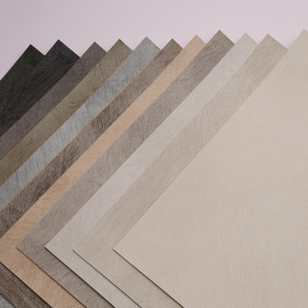
2. Natural texture, engineered. Plaster, limewash and grasscloth looks,historically expensive to install and fragile to maintain,are now replicated in high-fidelity print on modern substrates. Designers get the organic, hand-finished aesthetic of limewash or woven grasscloth with the durability commercial projects demand. Expect this to be the single most specified texture direction of 2026: matte, mineral-looking, quietly imperfect.
3. Oversized patterns and panoramic murals. The feature wall has grown into the feature room. Full-height, wall-wide panoramic artwork,abstract landscapes, tonal botanicals, architectural photography,is becoming standard in lobbies, restaurants and guest-room headboard walls. The look reads as bespoke art installation, but is delivered as a printed mural: project-scaled, seam-matched, and produced from a single artwork file, which makes it as practical for a 200-key hotel as for a single flagship space.
4. Biophilic, but quieter. The literal leaf print of past seasons is maturing into abstract natural texture: grain, stone veining, water surfaces, earth-tone gradients. The palette shifts from bright greens to clay, ochre, moss and slate,close enough to nature to calm, abstract enough to stay timeless.
5.Sustainability becomes part of the aesthetic. Low-VOC printing, green and environmentally friendly are no longer a footnote,clients increasingly see documented sustainability as part of the design story itself. Expect material provenance to appear in design narratives submissions alongside the palette and the pattern.
Where the Trends Land: Spaces to Watch
Hotel lobbies & bars. The darkest, most atmospheric schemes concentrate here: charcoal grasscloth-look walls behind warm brass and low lighting, or a floor-to-ceiling moody mural as the arrival moment. Dark palettes do what lighting design alone cannot,they create instant intimacy in large volumes.
Guest rooms & suites. Deep-toned headboard walls, botanical, abstract or destination-inspired,are replacing framed art as the room's signature element. Because the artwork is printed to the wall's exact dimensions, every room type can carry the same identity at different scale.
Restaurants & lounges. Oxblood and forest-green tonal textures with subtle sheen shifts read as luxury at dinner-light levels; panoramic botanical murals in muted earth tones create the "transported elsewhere" effect operators want.
Offices & executive floors. Dark, textured feature walls in meeting suites and reception areas project confidence and calm,and photograph better in brand and recruitment content than any white wall.
Wellness & spa. The quiet-biophilic direction dominates: stone, water and mineral textures in moss and slate tones, used to slow the eye and lower the temperature of the space.
How to Bring the 2026 Look Into a Project
Start from the palette, not the pattern. Choose two or three deep tones that carry the brand, then layer texture within them—tone-on-tone texture is what makes dark schemes feel considered rather than heavy.
Use texture where light will touch it. Matte mineral finishes near windows and lighting features pick up raking light and reveal their relief; keep large flat dark fields for zones meant to recede.
Scale the artwork to the architecture. A panoramic mural succeeds when it is designed for the actual wall,its height, its returns, its sightlines,rather than scaled up from a stock image. This is where working with a manufacturer that develops artwork at project scale pays off.
Anchor dark schemes with contrast. Dark walls read richest against warm metal, pale stone, natural timber and considered lighting. The wallcovering sets the mood; the contrast materials keep it from becoming a cave.
Document the sustainable story. Choose substrates and inks whose certifications can be quoted in the project narrative,2026 clients will ask.
Conclusion
2026's commercial interiors will be darker, more textured and more custom than anything in the past five years. Dark, moody palettes bring intimacy; engineered natural texture brings tactility without fragility; panoramic murals turn walls into brand statements; and quiet biophilic tones bring nature indoors without cliché. The trend is easy to name, executing it at project scale, with the right substrate and a design developed for the wall itself, is where spaces are won.
Planning a dark or textured scheme for 2026? Request free material samples or send us your wall dimensions for a custom mural proposal, we are here to help.